
UK A&M LABELS
For large scans of the images, click on the images: you may need to use the zoom feature in to see the full image
Overall, early albums came out on the classic brown label, with later albums appearing on silver labels. Whilst the US and Canada seemed to create separate promotional pressings with special labels, there don't seem to be any such things in the UK...

BROWN LABEL - EARLIEST DESIGN
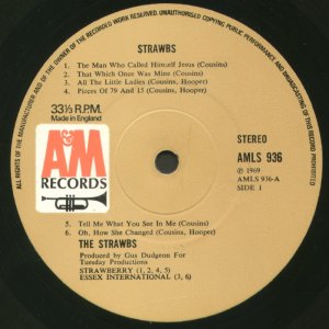
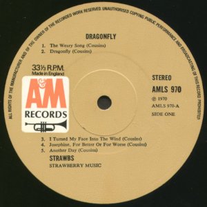
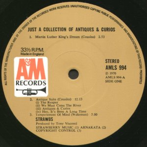
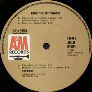
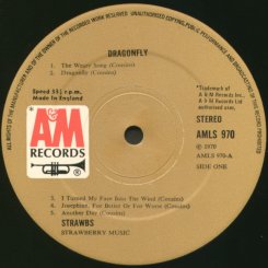
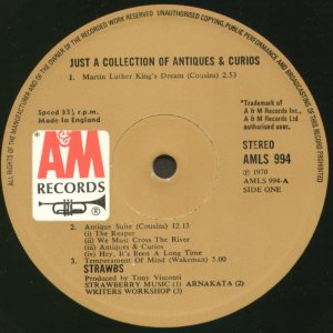
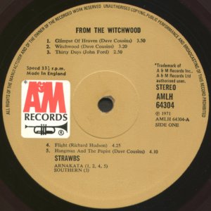
The first four A&M albums were released with this label design, distinguished from the later one by (a) looking at the 33rpm/Made in England text and (b) there's no trademark information on the label. From The Witchwood was the last to be released, but is hard to find, so I'd guess only the very first press had this label, and it was phased out in late 1971 after Witchwood was released in July of that year.
 |
|
|
Strawbs |
Dragonfly |
|
|
|
Antiques And Curios |
From The Witchwood |

BROWN LABEL - 1971 TO 1974
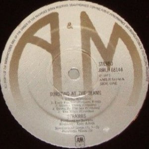
This design isn't all that different from the earliest. In the second half of 1971 (after Witchwood was first released), the A&M logo must have become a registered trademark, as there's now a circled "R" inside the white logo under Herb Alpert's trumpet. There's also an asterisk inside the A&M logo referring to some legal text about the trademark, and the text above the logo is now in a rather ugly font.
Some guide to the timing: the full release single "Witchwood" (very rare, as it was withdrawn before release in April 1971) has the old style logo, whilst "Benedictus", (recorded 15 Oct 1971, released later that year) has the trademark wording.
Grave New World was the first album to be first released on this design, and Two Weeks Last Summer and Bursting At The Seams followed, though all of the previous albums were reissued with it during its era, which probably came to an end at the end of 1973 when the silver label was adopted across (nearly) all the A&M world.
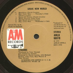
|
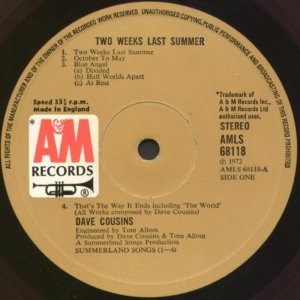
|
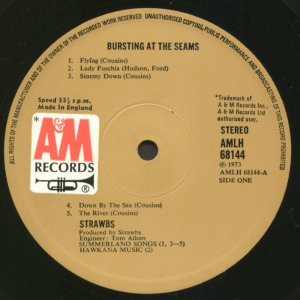
|
|
Grave New World |
Two Weeks Last Summer |
Bursting At The Seams |
Reissues
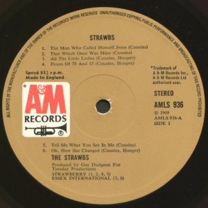
|
|
|
|
|
Strawbs |
Dragonfly |
Antiques |
Witchwood |

SILVER LABELS - INITIAL DESIGN
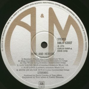
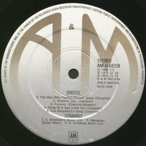
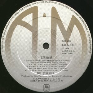
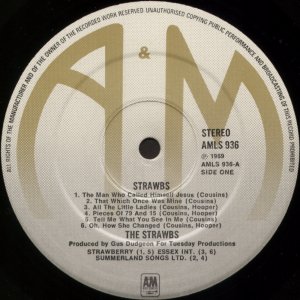
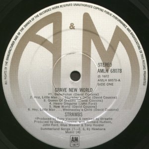
When introduced in early 1974, the album title and band name were in a relatively light typeface (initially serif "Times style" but later switching to a sna serif track listing), with a reasonably standard design. Hero And Heroine broke with the pattern and had the song titles in capitals, but all the reissues below probably came out in 1974 whilst this design was current).
|
|
|
By Choice |
Hero And Heroine |
Reissues
|
|
|
Strawbs (serif type) |
Strawbs (san serif type) |
 |
 |
|
Grave New World |
Bursting At The Seams |

SILVER LABELS - LATER VERSIONS
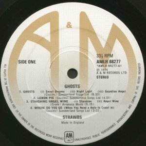
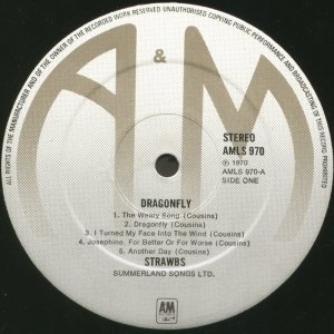
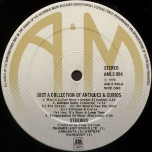
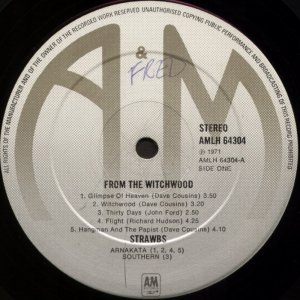
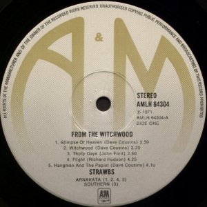
Ghosts was released in the UK in late 1974, and the label design had altered by then. Both band name and album title were in bold. Though, as Ghosts with multi part tracks, has a complicated label, the following reissues seem to follow the pattern and date from this period (though NB, it's perfectly possible that in order to save cost A&M didn't bother redoing the typography to match current designs for later reissues and just used the same designs as the previous one).
Reissues
|
 |
|
|
|
Dragonfly |
Antiques And Curios |
From The Witchwood |
From The Witchwood |

SILVER LABELS - MID TO LATE 70S
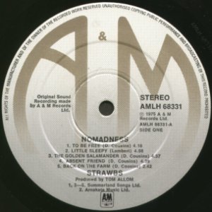
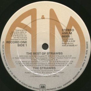
By end of 1975, when Nomadness came out, the design had moved on yet again, a less condensed typeface, and an increasingly lighter colouration for the "A" and the "M" (which may - or may not - tend to date any reissues there were). By the end of the 70s, sadly, the Strawbs' star in the UK was waning and there doesn't seem to have been much reissue action using this label design.
|
|
|
Nomadness |
Best Of Strawbs |


